
Mastering High-End Interior Color Palettes
Choosing the right colors for your high-end interior can be challenging. This guide will help you master luxurious color palettes, focusing on aesthetics, lighting, and nature-inspired hues. We'll explore how to select elegant colors, apply color psychology, and create timeless combinations. You'll learn techniques for layering colors and see real-world examples of luxurious palettes, including trendy shades of green and Pantone selections. By the end, you'll have the knowledge to craft a sophisticated and personalized color scheme for your home.
Key Takeaways
Color theory and lighting significantly influence the perception of luxury in high-end interiors
Balancing primary and accent colors creates visual harmony using techniques like the 60-30-10 rule
Textures and patterns add depth to color schemes, enhancing sophistication in luxury spaces
Monochromatic designs, jewel tones, and minimalist neutral palettes are effective for creating luxurious atmospheres
Renowned designers emphasize unexpected color combinations and consideration of lighting when creating high-end interiors
Understanding the Foundations of High-End Interior Color Palettes

High-end interior color palettes elevate luxury homes. This section explores color's role in upscale spaces, color theory basics, lighting's effect on paint appearance, and selecting premium materials. Understanding these elements helps create sophisticated rooms using brass accents, sand tones, and carefully curated palettes.
The Significance of Color in Luxury Interiors
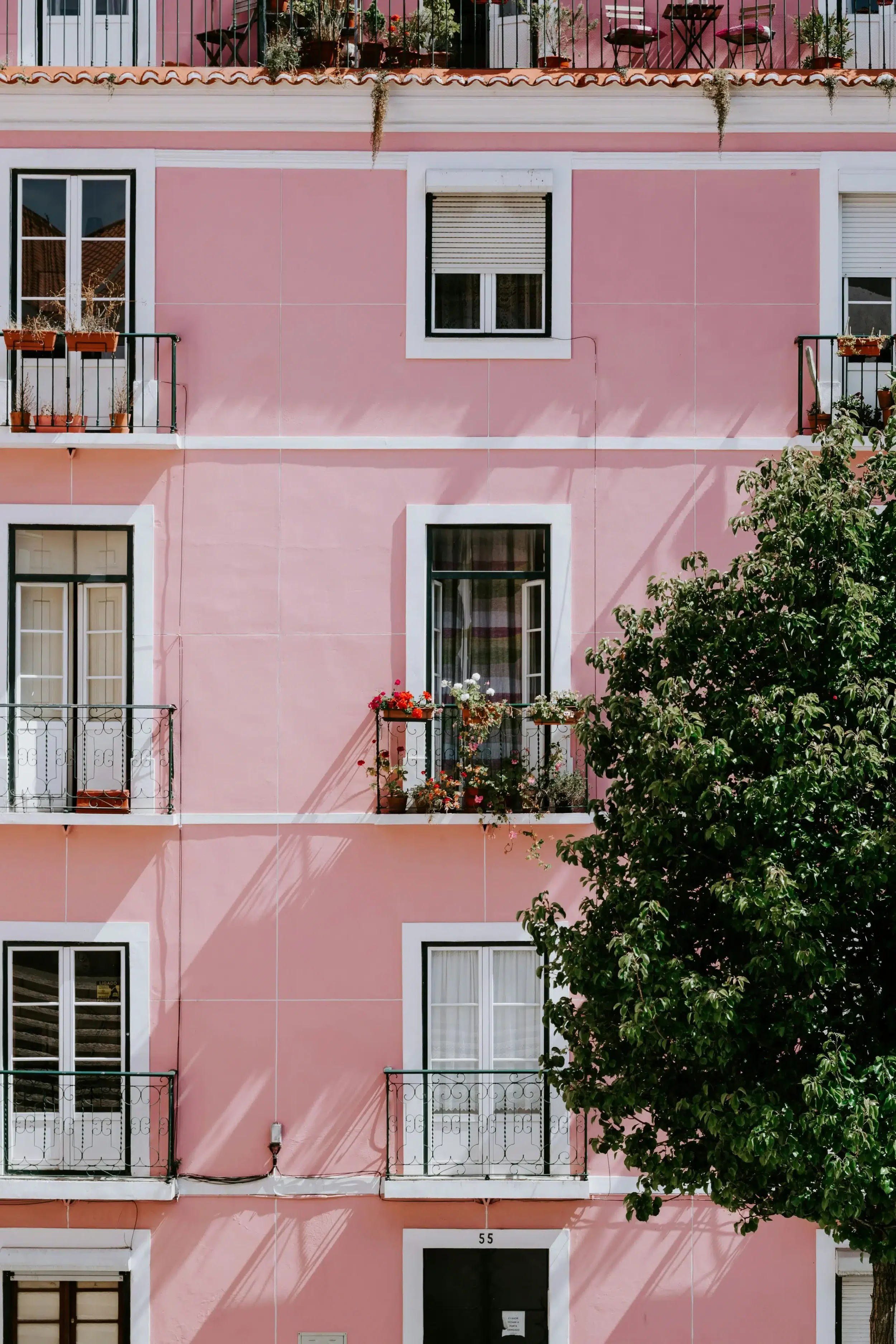
Color plays a crucial role in luxury interiors, setting the tone for sophistication and elegance. In high-end living rooms, designers often use rich hues like terracotta or taupe to create a sense of warmth and opulence. These carefully chosen colors work together to form a cohesive interior design scheme that reflects the homeowner's refined taste and elevates the overall ambiance of the space.
Fundamental Principles of Color Theory
Color theory forms the basis for creating stunning high-end interiors. Designers use color schemes to evoke specific moods and atmospheres in luxury spaces. For example, a grey and marble color scheme in a bathroom can create a sense of sophistication and tranquility. Understanding color relationships helps interior designers craft harmonious and visually appealing spaces that reflect refined taste:
| Color Scheme | Mood | Example Application |
|---|---|---|
| Monochromatic | Elegant, Cohesive | All-grey living room |
| Complementary | Dynamic, Bold | Blue and orange kitchen |
| Analogous | Harmonious, Calming | Green and blue bathroom |
The Impact of Lighting on Color Appearance
Lighting significantly influences the perception of color in luxury interiors. Natural and artificial light sources can alter the appearance of paint colors, affecting the overall atmosphere of a space. For instance, a sapphire blue wall may appear vibrant during the day but take on a deeper, more mysterious tone in the evening. Understanding the psychology of color and how lighting impacts it helps designers create the desired ambiance, whether it's a calming bedroom or a regal dining area with touches of purple.
Selecting Premium Paints and Materials
Selecting premium paints and materials is crucial for achieving harmony in high-end interior spaces. Luxury homes often feature lavender and blue hues paired with beige tones to create sophisticated environments. Designers carefully choose high-quality paints that offer superior coverage, durability, and color richness to ensure long-lasting elegance.Here are the paint types with their benefits and best use:
| Paint Type | Benefits | Best For |
|---|---|---|
| Matte Finish | Hides imperfections | Living rooms, bedrooms |
| Semi-Gloss | Easy to clean | Kitchens, bathrooms |
| High-Gloss | Reflects light | Trim, accent walls |
Selecting Colors That Define Elegance
Selecting colors for high-end interiors involves understanding luxury color theory and perception. This section explores sophisticated hues, refined neutral shades, bold accents, and harmonious color combinations. Each topic provides insights into creating elegant spaces that complement luxury furniture and reflect exquisite taste. These elements work together to define true elegance in interior design.
Identifying Sophisticated Color Hues
Sophisticated color hues elevate high-end interiors, creating an atmosphere of beauty and elegance. Designers often combine rich green tones with warm yellows in luxury kitchens to create a vibrant yet refined space. A blue color palette, ranging from deep navy to soft powder blue, adds depth and tranquility to living areas, complementing various design styles and furniture pieces.
Utilizing Neutral Shades for a Refined Look
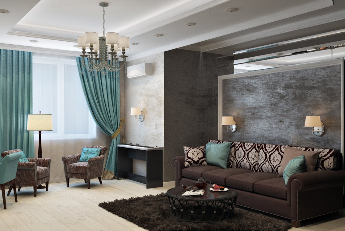
Neutral shades form the backbone of refined high-end interiors, creating a sophisticated canvas for luxury design. Interior designers often use monochrome color schemes, incorporating varying shades of grey, beige, or cream to establish a sense of calm and elegance. These neutral hues serve as a perfect backdrop for statement pieces, allowing the architecture and carefully chosen textiles to shine. Navy blue, while not strictly neutral, often functions as a grounding color in high-end spaces, adding depth and drama to the palette.
Incorporating Bold Tones for Luxury Accents
Bold colors bring drama and luxury to high-end interiors. Designers often use the color wheel to choose striking accents that complement neutral backdrops. In bedrooms, rich wood tones can be paired with vibrant hues like emerald green or deep purple to create a luxurious atmosphere. Even in minimalist spaces, a single bold color can serve as an eye-catching focal point. Examples include:
A deep red accent wall in a neutral living room
Gold fixtures in a white bathroom
A jewel-toned velvet sofa in a gray study
Combining Warm and Cool Colors Harmoniously
Interior designers expertly blend warm and cool colors to create harmonious, high-end spaces. By balancing rich emerald tones with soft pastels, they design sophisticated rooms that evoke both energy and tranquility. This approach offers a range of design options, from bold accent walls to subtle color transitions throughout a space.For example:
Warm golden accents paired with cool blue walls
Soft pink furniture against a deep teal background
Earthy brown wood floors complemented by crisp white ceilings
Applying Color Psychology to Elevate Spaces

Color psychology elevates high-end interiors by influencing emotions and moods. This section explores how colors like velvet orange and sienna affect living spaces. It examines techniques for evoking specific atmospheres and aligning color choices with room functions. Understanding complementary colors helps create balanced, sophisticated environments that reflect luxury and style.
Interpreting Emotional Responses to Colors
Color psychology plays a crucial role in high-end interior design, influencing emotional responses and setting the tone for luxurious spaces. Primary colors and their various shades and tones evoke different feelings, with shades of blue often associated with calm and serenity. Designers use this knowledge to create brand-specific atmospheres in luxury homes, carefully selecting color palettes that align with the desired emotional impact and overall aesthetic:
| Color | Emotional Response | Suitable Spaces |
|---|---|---|
| Deep Blue | Trust, Stability | Home Office, Library |
| Soft Green | Relaxation, Nature | Bedroom, Spa |
| Rich Purple | Luxury, Creativity | Dining Room, Theater |
Designing Rooms to Evoke Specific Moods
Colors play a crucial role in designing rooms to evoke specific moods in high-end interiors. Designers carefully select color palettes to create desired atmospheres, such as using cool blues and greens for a calming bedroom or warm oranges and reds for an energizing home office. By understanding the psychological impact of colors, interior designers can craft spaces that not only look luxurious but also elicit the intended emotional responses from occupants.
Aligning Color Choices With Room Functions
Aligning color choices with room functions enhances the effectiveness of high-end interiors. Designers select hues that support each space's purpose, such as calming blues for bedrooms or energizing yellows for home offices. This thoughtful approach creates a cohesive flow throughout the home while optimizing each room's functionality:
| Room | Color Choice | Function |
|---|---|---|
| Kitchen | Warm Oranges | Stimulate Appetite |
| Study | Deep Greens | Promote Focus |
| Living Room | Neutral Grays | Versatile Relaxation |
Crafting Timeless and Trend-Resistant Palettes

Crafting timeless and trend-resistant color palettes is essential for high-end interiors. This section explores classic color combinations that stand the test of time, ways to blend modern elements with traditional hues, and strategies for avoiding overused color trends. These approaches help create sophisticated, enduring spaces that reflect luxury and personal style.
Embracing Classic Color Combinations
Classic color combinations form the foundation of timeless high-end interiors. Designers often pair rich navy blues with crisp whites for a sophisticated nautical theme, or blend warm earth tones with cool greys for a balanced, elegant look. These enduring palettes create luxurious spaces that withstand changing trends:
| Classic Combination | Mood | Application |
|---|---|---|
| Black and White | Timeless Elegance | Formal Living Rooms |
| Navy and Gold | Opulent Sophistication | Master Bedrooms |
| Sage Green and Cream | Natural Serenity | Spa-like Bathrooms |
Integrating Modern Elements With Traditional Colors
Integrating modern elements with traditional colors creates timeless high-end interiors. Designers blend contemporary furniture pieces with classic color schemes, such as pairing a sleek, minimalist sofa with walls painted in timeless beige or grey tones. This approach allows for the incorporation of current design trends while maintaining a sophisticated, enduring aesthetic. Key strategies for successful integration include:
Using traditional colors as a backdrop for modern art pieces
Incorporating contemporary lighting fixtures in rooms with classic color palettes
Balancing bold, modern patterns with subdued, traditional hues
Avoiding Overused Trends in Color Selection
To avoid overused trends in color selection, high-end interior designers focus on timeless hues and unique combinations. They steer clear of fleeting fads like millennial pink or ultra violet, opting instead for sophisticated shades that stand the test of time. By selecting colors based on the home's architecture, natural light, and the client's personal style, designers create enduring palettes that exude luxury and individuality.
Techniques for Layering and Contrasting Colors
Layering and contrasting colors are key techniques in high-end interior design. This section explores balancing primary and accent colors, using textures and patterns for depth, implementing color gradation, and coordinating furnishings with wall colors. These methods help create visually interesting and sophisticated spaces that reflect luxury and style.
Balancing Primary and Accent Colors
Balancing primary and accent colors creates visual harmony in high-end interiors. Designers often use the 60-30-10 rule, applying a dominant color to 60% of the space, a secondary color to 30%, and an accent color to 10%. This approach ensures a cohesive look while allowing for pops of color that add interest and depth to luxury spaces.
Using Textures and Patterns to Enhance Depth
Textures and patterns add depth and visual interest to high-end interiors, enhancing the chosen color palette. Designers use a variety of materials and surfaces to create layers within a space, such as pairing smooth silk curtains with a textured wool rug in complementary hues. This technique adds sophistication to luxury rooms and creates a multidimensional color experience. Patterns, from subtle geometric prints to bold florals, can be incorporated through wallpapers, fabrics, or artwork to further enrich the color scheme:
Velvet upholstery in deep jewel tones for added richness
Textured wallpaper in neutral shades for subtle depth
Patterned throw pillows to introduce accent colors
Woven window treatments for layered light filtration
Implementing Color Gradation for Visual Interest
Color gradation adds visual interest and sophistication to high-end interiors. Designers use this technique to create smooth transitions between hues, often within the same color family. By gradually shifting from light to dark shades, they establish depth and movement in a space. This approach works well in large areas like living rooms or bedrooms, where walls can showcase a subtle ombre effect:
| Gradation Type | Effect | Application |
|---|---|---|
| Monochromatic | Subtle elegance | Bedroom walls |
| Complementary | Dynamic contrast | Living room decor |
| Analogous | Harmonious flow | Open-plan spaces |
Coordinating Furnishings With Wall Colors
Coordinating furnishings with wall colors is essential for creating cohesive high-end interiors. Designers often select furniture pieces that complement or contrast with the wall colors to achieve a balanced look. For example, in a room with deep blue walls, they might choose cream-colored sofas to create a striking contrast, or opt for furniture in varying shades of blue for a monochromatic effect. This careful coordination ensures that the furniture enhances the overall color scheme, contributing to a sophisticated and harmonious space.
Conclusion
Mastering high-end interior color palettes is essential for creating elegant and sophisticated living spaces. By understanding color theory, psychology, and the interplay of hues, designers can craft timeless environments that evoke specific moods and enhance a room's functionality. The careful selection and application of colors, from classic combinations to bold accents, allow for the creation of luxurious interiors that reflect personal style while standing the test of time. Ultimately, the art of crafting elegance through color palettes transforms houses into homes, elevating the everyday living experience to one of refined beauty and comfort.